Friday, 27 January 2012

Screen shots from our prelim edit


These are some screenshots from the process of editing sound onto our preliminary. Firstly, we edited our sequence on Final Cut Pro. Afterwards when adding sound to our clip we imported our clip onto soundtrack and opened our video on soundtrack pro.
We then proceeded to search for instruments and sound effects to add to our clip. Once we found a sound effect we liked we dragged it onto the music timeline and added it to the part of the clip we wanted the sound effect to play at. We quickly found out that you could drag the volume down at certain parts of the clip. For example, we wanted to hear the fingernails tapping in the clip but we wanted to mute the sounds of drilling from the builders working next door that precedes it. It was very easy to edit the sound and quite an enjoyable process. 

Preliminary Final Edit


PRELIM FINAL EDIT

This is our final edit of our preliminary. When we were exploring the different sounds to add to our clip we found problems with timing and syncing some sound effects with the pace of our clip. For example, the footsteps sound effect does not match the pace that our actor was walking with so we are aware the sound effects in our edit are slightly out of sync, however, this has being a  learning curve and overall we think the shots and editing is good and we think that this edit has come out much better and is more professional looking in comparison to our 'Killers' remake.

Thursday, 26 January 2012

Art of the title

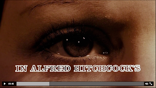
Art of the title is a website that posts and analyses all types of different film and television opening sequences from around the world. The website lets people post their own title sequences and explain them. I found watching the other peoples openings very useful and was inspired by quite a few of them.  Two of the videos really stood out to me, Rubicon and Vertigo.


  VERTIGO


The opening to Vertigo clearly presented the genre, it set the atmosphere and the way the titles were included worked extremely well.


                                                                          RUBICON


The opening to Rubicon was exceptionally good, to me it looked completely professional. I found it really clever how the numbers and dates and times mixed together and how the yellow highlighter took it form one credit to the next whilst connecting clues, which gave a clear idea of the genre. However i think they would have been marked down for the fact the films title was so near the end as in a normal opening sequence the title is at the beginning/middle 

Sunday, 22 January 2012

Art of the title

Art of the title is a very useful website that analyses all types of film openings; from thriller to comedy. The website is very helpful in finding out about how to analyse title sequences, film trailers, openings for films and some very interesting documentaries such as making of films etc.

The film I chose to review is 'Ginger Snaps' an American horror thriller released in 2000.

The opening of Ginger Snaps starts of with the introduction of the actress Emily Perkins, who plays the main role in the film. This is strange as usually your conventional title sequence opens with that of the production company; this may suggest that this is not your typical conventional film. More actors are introduced until finally the Casting Director Robin D. Cook C.D.C is given props.  The Costume designer Lea Carson comes next followed by special make up and creature effects Paul Jones, Original score Michael Shields and Production designer Todd Cherniawsky are introduced next.  Following suit is Editor Brett Sullivian, Director of photography Thom Best and Story by Karen Walton & John Fawcett. Afterwards is produced by Steve Hoban and Karen Lee Hall and finally the director John Fawcett comes last. The films title is not mentioned throughout the film opening and neither is the production and distribution company which might mean that this was an independent film. 

Student Opening Analysis - The Grove

I chose to analyse this film opening because it stands out in comparison to the other student films; which nearly all resemble a 'The Grudge' type character who eats human meat and is smothered in blood. I chose to analyse 'The Grove' because it reminds me very much of the popular film Arlington Road (1999) which is a discrete title sequence in the fact that the opening is stylized and very edited giving a creepy and chilly effect without even seeing a dead body or blood everywhere and The Grove has instilled this into its opening very effectively.

The opening starts off with the expected Production company introduced first; the shot here is stylized and looks very creepy, the tree stands out the most in this shot.

Straight away we are introduced to the director which makes a nice subtle change to the director always coming last. The effect of the stylized edit makes the leaves look blood soaked and eery.

In this shot the water drips upwards; they filmed the water dripping and then reversed it and the outcome is brilliant and I would consider using this in my own film opening. However, the font colour change i do not agree with because it looks unprofessional and contrasts greatly with the preceding shots.


I like how twice they get a shot of the streets name but in different types of shots and edits; this is similar to what 'Arlington Road; does. The fact that 'The Grove' is shot twice emphasizes that it is imperative to the film opening.

The shot fading into another shot looks really good and adds a spooky supernatural element to the film opening. It shows that this is a thriller without having to use the obvious blood and gore.

I really like this shot because it looks very artistic.

The fact that the film title came last in the opening would mean they were definitely given a lower mark and i would have suggested putting the film title somewhere between the stylized shot over shot or just before the dripping water. I think this is the only real drawback of their entire film opening and I would have given it a very high mark overall if I had to mark their piece.

Saturday, 21 January 2012

Match Cut Preliminary photos

These are some pictures of us in the process of filming our match cut preliminary scene. In contrast to our 'Killers' remake we knew how to set up and use the camera and in the end the quality of our filming was much better as previously we had forgotten about the '2/3 rule' when filming a person. We also had more fun with this set of filming unlike last time where we felt pressured to produce a good piece of work; thus this time round we're positive the end result will be much better. 

Setting up the camera onto the tripod.


Emily getting into character.

Checking if Emily was in two thirds of the scene.

In the process of filming.


An example of closeup.
Yay we finished!